Create a theme add-on#
This chapter describes how to create a custom theme add-on for Plone Classic UI.
You can install your theme add-on in the Add-ons control panel. Theme add-ons are a convenient way to design once, then deploy with minimal effort everywhere.
Prerequisites#
To create an add-on package with a Plone Classic UI theme, you need to install the following prerequisites.
Create a Classic UI theme add-on package#
To create a Classic UI theme add-on, begin with the following command.
plonecli create addon plonetheme.themebasedonbarceloneta
Then change the working directory into the package you just created, and add the basic theme structure with the following commands.
cd plonetheme.themebasedonbarceloneta
plonecli add theme_barceloneta
Give your theme a name, and optionally commit the changes. After that, the theming structure is set up and ready for customization.
See also
Compile theme resources#
To compile the SCSS code, you have to install the required dependencies with npm.
Then run the package script build inside the theme/ folder.
npm install
npm run build
During theme development, you can automatically compile SCSS resources when you change something inside the scss/ folder.
You can also preview your changes when you reload your browser.
To do so, run the following command.
npm run watch
Customize Bootstrap components#
The base scss/theme.scss file provides all imports of the dependent Bootstrap resources to build the default Classic UI theme.
As a convenience bobtemplates.plone has created three files to customize variables, maps, and custom SCSS code.
scss/_custom.scssscss/_maps.scssscss/_variables.scss
SCSS and root variables#
To set a custom font, you define the font variables in scss/_variables.scss as shown.
$font-family-sans-serif: Tahoma, Calimati, Geneva, sans-serif;
$font-family-serif: Georgia, Norasi, serif;
This will override the default values from Classic UI.
SCSS and properties#
The following example shows how to disable rounded corners for borders.
$enabled-rounded: false;
See a complete reference list of Classic UI's CSS custom properties.
Maps#
Maps are key/value pairs to make CSS generation easier. As an example, the following example shows the workflow colors map.
$state-colors: (
  "draft":                          $state-draft-color,
  "pending":                        $state-pending-color,
  "private":                        $state-private-color,
  "internal":                       $state-internal-color,
  "internally-published":           $state-internally-published-color,
) !default;
If you have a custom workflow state, you can add your state color to the default map in scss/_maps.scss as shown below.
$custom-state-colors: (
  "my-custom-state-id": "#ff0000"
);

// Merge the maps
$state-colors: map-merge($state-colors, $custom-colors);
Custom CSS code#
Inside the file theme/_custom.scss you can write all your custom CSS/Sass code to adapt the theme to your needs.
Feel free to add more files inside the scss/ folder to make your code more readable.
Don't forget to import your custom files in scss/theme.scss.
Styles test rendering#
Plone's Classic UI includes special demonstration views that render ready-made examples of interface components using your site's active theme. These views help developers verify styling implementation and explore available UI patterns. These views work in any context. No special permissions are required.
Append one of the following view names with a leading slash / to any Plone site URL.
/@@test-rendering/@@test-rendering-cheatsheet/@@test-rendering-icons
Each view name corresponds to a named tab in Plone as described in the following sections.
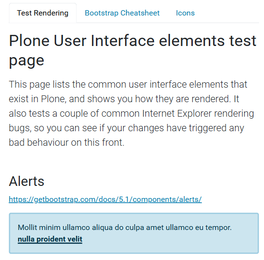
Test Rendering#
The Test Rendering tab at the view name @@test-rendering displays Bootstrap style status message examples.
It shows all alert variants including:
Success, warning, and error notifications
Dismissible alerts
Contextual color examples
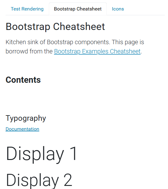
Bootstrap Cheatsheet#
The Bootstrap Cheatsheet tab at the view name @@test-rendering-cheatsheet displays the kitchen sink of Bootstrap components.
It includes the following examples and dozens more:
color mode switcher interface, located in the lower right corner of the browser window
grid layout examples
form control variants
navigation components
interactive element states
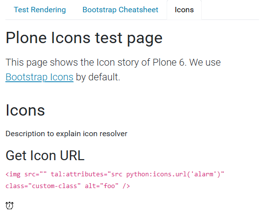
Icons#
The Icons tab at the view name @@test-rendering-icons displays a few icon classes.
It includes the following examples:
icon resolver usage
code samples for both URL and tag generation
See also
For an overview of UI components in Volto, see its Storybook.