Editor Configuration#
You can customize how volto-slate editor behaves and its features.
These are controlled from the config.js settings.
slate.styleMenu#
Add a menu applying CSS classes to text passages or entire paragraphs.
slate.styleMenu.inlineStyles are applied to selected text passages, while slate.styleMenu.blockStyles are applied to selected paragraphs.
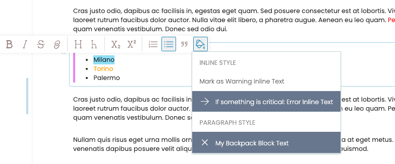
slate.styleMenu.inlineStyles = [
    {
      cssClass: 'cool-inline-text',
      label: 'Cool Inline Text',
      icon: (props) => <Icon name={iconSVG} size="24px" />,
    },
  ];
  slate.styleMenu.blockStyles = [
    {
      cssClass: 'underline-block-text',
      label: 'Cool Block Text',
      icon: (props) => <Icon name={iconSVG} size="24px" />,
    },
  ];
defaultBlockType#
The default block type for a website.
config.settings.defaultBlockType = 'slate';
slate.persistentHelpers#
A set of components that are always rendered, unlike the button variety. They make it possible to orchestrate form-based editing of components.
slate.persistentHelpers = [
  ...(slate.persistentHelpers || []),
  (props) => <MyPersistantComponent /> || null,
];
slate.extensions#
The Slate editor is "decorated" with the capabilities from this list.
slate.extensions = [
  ...(slate.extensions || []),
  insertData,
  isInline,
  normalizeNode,
];
slate.hotkeys#
Shortcut keys pertaining to a feature from a plugin or behavior.
slate.hotkeys = {
  ...slate.hotkeys,
  'mod+b': { format: 'strong', type: 'inline' },
  //more hotkeys, including from plugins!
};
slate.keyDownHandlers#
Handle keyDown events for the Slate editor.
slate.keyDownHandlers = { 'mod+b': () => {} };
slate.elements#
Render View and Edit components for a particular Slate element that consumes deserialized or normalized data.
slate.elements = {
  ...(slate.elements || {}),
  h1: ({ attributes, children }) => <h1 {...attributes}>{children}</h1>,
  element: (props) => <ElementComponent {...props} mode="edit" />,
};
slate.nodeTypesToHighlight#
Adds "highlight" decoration in the editor.
Used by the highlightByType method.
slate.nodeTypesToHighlight.push(elementType);
slate.runtimeDecorators#
These are "runtime" decorator functions. These are transient decorations that are applied in the editor. They are not persisted in the final value, so they are useful, for example, to highlight search results or a certain type of node.
slate.runtimeDecorators = [([node, path], ranges) => ranges];
slate.useLinkedHeadings#
The setting slate.useLinkedHeadings controls whether volto-slate creates anchors for headings, such as h1 and h2, in the editor.
The default setting is true.
You can opt out of this feature by setting its value to false.
slate.useLinkedHeadings = false
Changed in version Volto: 17.0.0-alpha.28
This feature is still enabled by default, but has a condition to show only for authenticated users.
blocks.initialBlocksFocus#
Determine which type of block should be selected on edit.
blocks.initialBlocksFocus === {
  <content type name>: <block type>
};
Disable selection of any block and prevent scrolling to a block:
blocks.initialBlocksFocus === null;